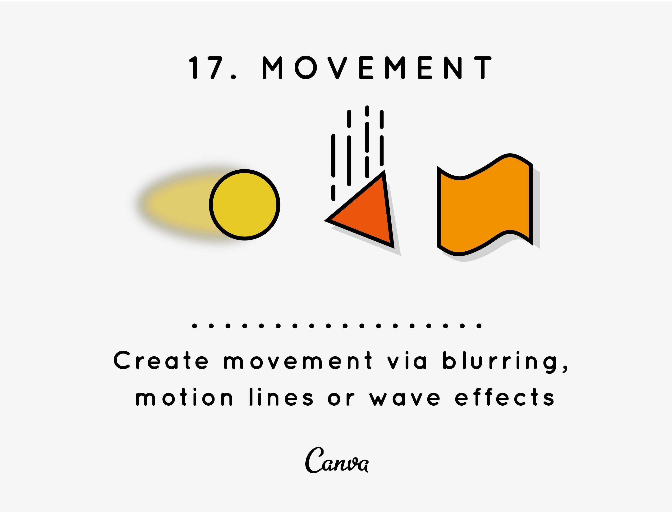
Have you ever heard or seen somebody describe a painting or piece of art as having “a lot of movement to it”? You might have first been baffled by that explanation – after all, how does a static painting move? But, movement is a big part of the visual arts, including graphic design.

Earlier we discussed the direction and flow of your design, these factors play a big part in the movement of your design. If your final piece has a good flow from top to bottom, left to right, corner A to corner B, etc., your piece will ‘move’ smoothly.
But, what about the cases where you want to give an element a literal sense of movement? Maybe you have a ball that you want to show in motion, or a car that you want to depict zooming down a highway. There’s a lot of ways you can depict this kind of movement, so let’s run over a few examples.
First, we have transparency. We briefly touched on how transparency/opacity can create motion for your designs earlier, but let’s look a little deeper.
This logo example by Vladimir Mirzoyan layers sharp geometric shapes of various opacities over each other to replicate a hummingbird’s wings in flight. The simple effect of overlaying these elements creates a clean, clever and sophisticated sense of movement.

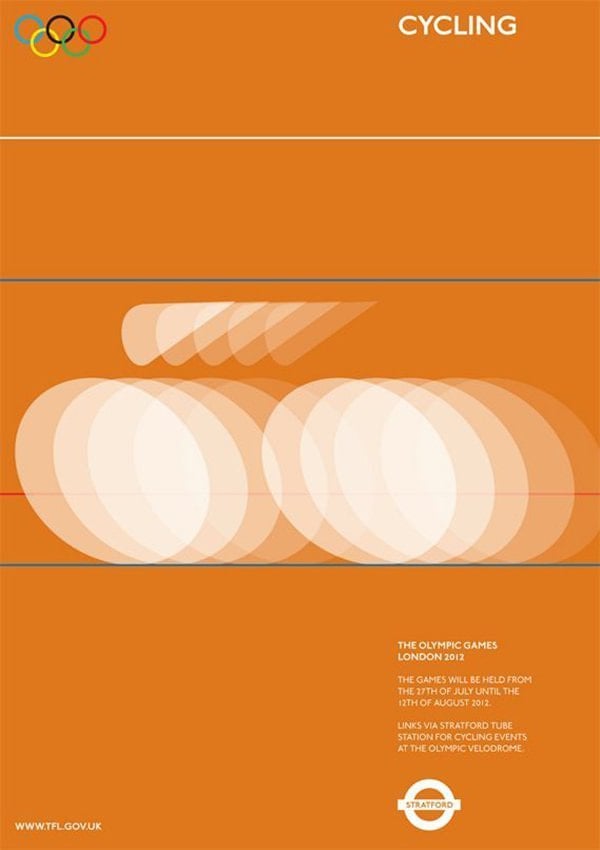
Similarly, check out this proposed poster design by Alan Clarke for the 2012 Olympic Games. By layering simple shapes of varying opacities, this poster creates a strong sense of speed and motion.

Movement can also be achieved through a blur effect. Check out this example that applies motion blur effects to a typically static design element – type.
This example, a book cover by German designers Anzinger, Wüschner, Rasp, applies an intriguing blur to the edges and corners of the letter to create an illusion of movement.

And finally, movement can also be captured through motion lines. These are common in comics and illustrations, when a character is running away, or moving swiftly. So, channel your inner comic book illustrator and make the most of motion lines. Let’s look an example.
This example below by Matt Chase uses motion lines subtly on the ‘future’ to indicate movement. A subtle but effective way of giving the design a dynamic edge and indicating movement.

