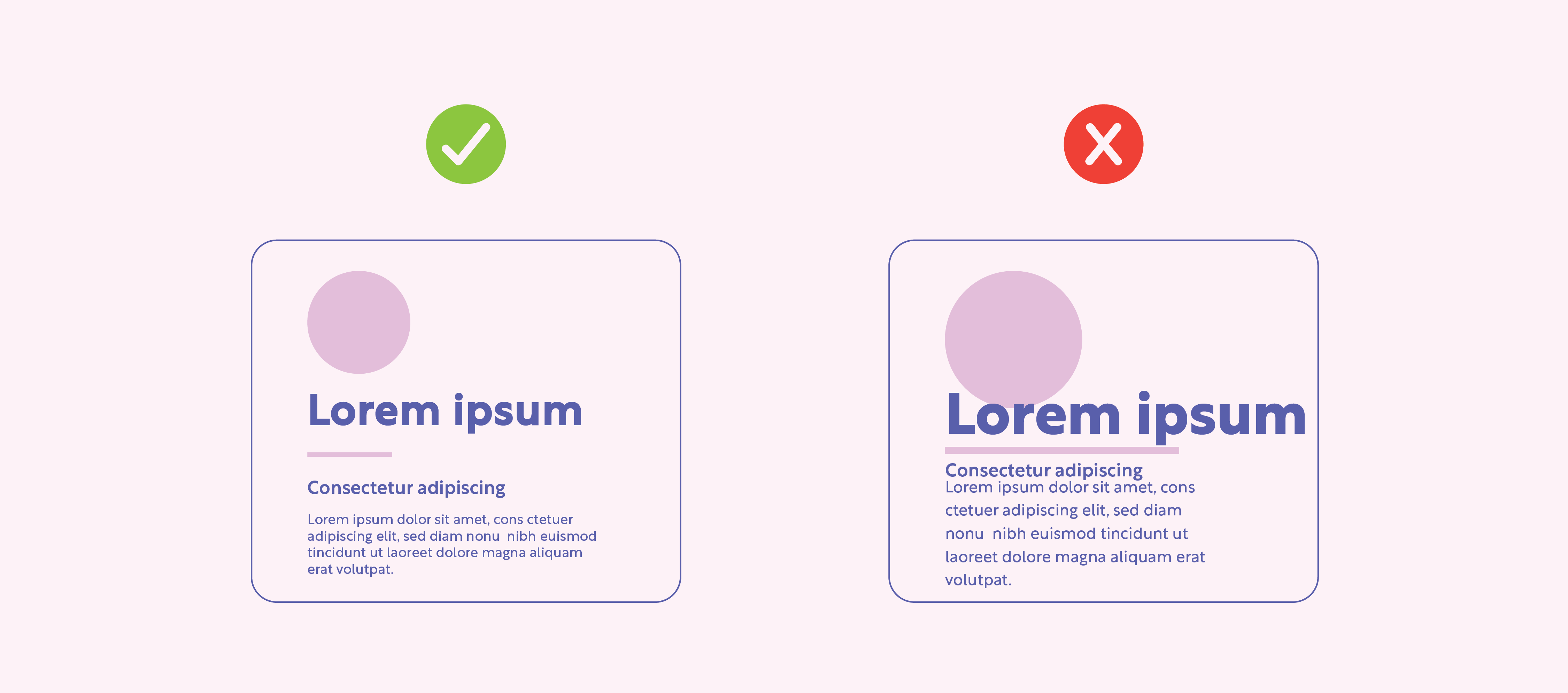
Every good design needs white space.

What does that mean? There needs to be balance of design elements with the negative space that surrounds the elements. This allows our eyes to rest and not get overwhelmed with information as it’s being presented to us.
